

Best Digital Marketing Tools in 2026: What Marketers Actually Need and What They Can Skip
Open LinkedIn for a few minutes and you will probably come across a colourful graphic…
 Harika October 6, 2026
  By HarikaUpdated September 20, 202612 min read126 views
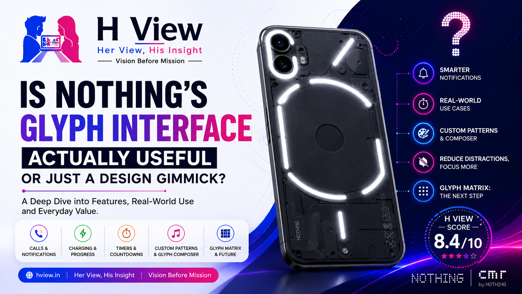
Nothing’s Glyph Interface is one of the most recognisable smartphone features introduced in recent years.
Place a Nothing phone face down on a table, and the illuminated rear immediately makes it stand apart from the familiar glass panels and oversized camera modules used by most manufacturers. The lights can react to calls, notifications, timers, charging and selected system actions, depending on the model.
It looks different, photographs well and gives Nothing phones a clear identity.
But that creates an important question:
Is the Glyph Interface genuinely useful in everyday life, or is it mainly a clever design feature created to attract attention?
The answer is not completely positive or negative. Glyph can be practical when it is configured around a user’s routine. However, it can also become something people admire during the first week and rarely notice later.
The feature’s real value depends less on how impressive it looks in a product video and more on whether it helps people check their phones less often.
The Glyph Interface is Nothing’s rear lighting system. On supported phones, different light strips or illuminated areas work with sounds and vibration patterns to communicate information without requiring the user to look at the display.
Nothing describes the system as a new way for users to communicate and interact with their phones. Preset ringtones and notification sounds are paired with their own Glyph patterns, allowing light, sound and vibration to respond together.
The exact layout and available functions differ between Nothing phone generations.
Earlier Nothing phones used larger LED strips arranged across the transparent-inspired rear panel. Models such as the Phone (2a) adopted a smaller Glyph arrangement around the camera area, while newer devices have continued experimenting with simplified lighting or more advanced matrix-style systems.
This means “Glyph” is no longer one fixed feature. It is becoming a broader design language that Nothing adapts according to the phone and its price category.
The most useful Glyph concept may also be the least complicated: putting the phone face down and receiving light-only alerts.
Nothing calls this Flip to Glyph. When activated, the phone can briefly signal incoming calls and notifications through its rear lights while reducing conventional sound alerts.
This has a practical purpose.
People often unlock their phones only to check one notification and then become distracted by several applications. A message leads to social media, social media leads to a video, and a quick glance becomes ten minutes of screen time.
Glyph offers an alternative. A user can place the phone face down and allow only selected light patterns to interrupt them.
This can be useful while:
The feature does not eliminate distraction automatically. A flashing light can still attract attention. However, it creates the possibility of receiving basic information without opening the entire digital world on the other side of the phone.
That is where Glyph begins to feel more meaningful than decorative.
Nothing allows preset ringtones and notification sounds to use corresponding Glyph patterns. Users can preview these patterns and choose different sounds through the Glyph Interface settings.
In theory, this means users can recognise different callers or alert types through light and sound combinations.
A family member could have one pattern. Work calls could use another. General notifications could follow a less urgent sequence.
This is useful only when the number of patterns remains manageable.
If a user creates too many combinations, remembering which pattern belongs to which person or application becomes difficult. The phone then flashes beautifully, but the user still has to turn it over to understand what happened.
Glyph works best when it communicates a few important distinctions:
Simple patterns can reduce uncertainty. Too many patterns can create a new language that users never fully learn.
A visual timer is a strong example of what Glyph should become.
When a rear light progressively changes as time passes, the user can check the remaining duration from across a desk without touching the phone.
This can help while:
Nothing has promoted Glyph timer functionality on supported models, along with visual indications for volume and other system activities.
A timer is valuable because its meaning is immediately understandable. Users do not need to memorise a complicated pattern. A shrinking light or changing progress indicator naturally communicates that time is running out.
This is the kind of function that moves Glyph beyond branding.
On some Nothing phones, Glyph can provide charging-related information or progress indications.
This sounds minor, but it can be convenient when the device is connected to a charger on a desk. A user may be able to estimate charging progress without activating the display.
However, Glyph features are not identical across every Nothing model. Certain functions available on one phone may be absent or implemented differently on another.
This inconsistency creates confusion.
When buyers see “Glyph Interface” in marketing, they may assume every Nothing phone provides the same capabilities. In reality, the number of lights, progress features, customisation options and software functions can vary significantly.
Nothing should explain these differences more clearly on each product page. Glyph needs a simple compatibility chart showing exactly what every model supports.
Glyph can also support photography.
On compatible phones, the rear lighting can show a camera countdown, helping the person being photographed understand when the image will be captured. Nothing has also promoted the lights as a soft illumination source for nearby subjects.
The countdown is genuinely useful for group photographs.
When the phone is placed on a stand or stable surface, people can see the visual sequence without depending only on a small number displayed on the screen.
Using Glyph as a light source is more situational. It may help with close objects or provide a softer appearance than a harsh flash, but it should not be mistaken for professional lighting.
Still, both features show how the rear illumination can perform practical tasks rather than acting only as decoration.
Glyph can react to music and create lighting patterns based on sound.
This is entertaining, especially when demonstrating the phone to friends or playing music in a dim room. Nothing has presented real-time music visualisation as one of the system’s experiential features.
However, it is difficult to describe this as essential.
Most users will not place their phones face down and watch the lights every time they play a song. The feature adds personality, but it does not solve a meaningful problem.
That does not make it worthless.
Technology is allowed to be enjoyable. Every feature does not need to improve productivity. Custom animations, wallpapers and notification sounds also exist partly because people enjoy personalising their devices.
The problem begins only when a fun feature is promoted as a major practical innovation.
Music visualisation is a good extra, but it should not influence a serious purchasing decision.
Nothing has allowed users to create or select customised Glyph sequences through its software tools and sound patterns.
This gives the feature a more personal character. Instead of using only the patterns provided by the company, owners can create light-and-sound combinations that suit their preferences.
The creative aspect fits Nothing’s brand well.
However, customisation has the same limitation as notification patterns: a feature becomes less useful when it becomes too complicated.
Most owners are unlikely to spend significant time composing detailed sequences. Enthusiasts may enjoy it, while ordinary users may select one or two presets and never open the composer again.
The composer strengthens Glyph as a creative platform, but it is not the feature’s strongest everyday argument.
Nothing has also expanded the concept beyond conventional light strips.
Its Glyph Matrix approach uses a denser collection of small LEDs capable of displaying more detailed visual information and interactive experiences. Nothing’s Playground platform allows creators to submit small “Glyph Toys,” including timers, call-status tools, visualisers and utility concepts.
This has greater potential than simple notification lighting.
A matrix can communicate symbols, numbers, progress information and small animations more clearly. It could support:
Nothing’s support material also shows Glyph Toys being enabled through the phone’s Glyph settings and activated through a dedicated control.
The opportunity is exciting, but the risk is also obvious.
A rear display can easily become another screen demanding attention. Nothing originally positioned Glyph as a way to reduce dependence on the main display. If the rear becomes filled with games, animations and constant information, the company could weaken its own argument.
The best Glyph Matrix tools will be glanceable, practical and quiet.
Even useful ideas can disappear from a person’s routine.
Several factors can make Glyph less valuable over time:
Many people naturally keep their phones with the screen visible. In that position, the rear lights provide little benefit.
Transparent or specially designed cases can preserve Glyph visibility, but thicker or opaque cases may hide the system.
A smartwatch can identify callers, display messages, show timers and provide vibration alerts more clearly than rear phone lights.
When every application produces a similar light response, the user still needs to check the display.
A feature that feels exciting during the first week may gradually become part of the background.
These are not software bugs. They are behavioural limitations.
Glyph requires the user to build habits around it. Without those habits, it becomes an attractive visual element rather than an everyday tool.
No one should buy a smartphone only because its rear panel lights up.
A phone must first provide:
Glyph should complement those fundamentals, not replace them.
When two phones offer similar value, Nothing’s design and Glyph experience may become a meaningful differentiator. But when a competitor provides significantly better cameras, performance or support at the same price, rear lighting should not outweigh those differences.
Glyph can influence a decision. It should not control it.
The Glyph Interface needs clearer development in several areas.
First, Nothing should make feature availability easier to understand across models. Users should know exactly which phones support charging progress, timers, custom patterns, third-party integration or advanced Glyph Toys.
Second, more applications should be able to use Glyph meaningfully. Delivery progress, ride status, recording indicators and navigation information could make the system more practical.
Third, customisation should remain simple. Users should be able to assign priority alerts without navigating through complicated settings.
Finally, Nothing should protect the original purpose of Glyph: communicating information without pulling users into the main display.
More functionality is valuable only when it reduces friction rather than creating another source of distraction.
Design Identity — 9.6/10
Glyph gives Nothing phones a distinctive visual signature that is immediately recognisable.
Everyday Usefulness — 7.9/10
Timers, calls, light-only alerts and camera countdowns can be helpful, but usefulness depends heavily on user habits.
Customisation — 8.5/10
Sound patterns, lighting options and Glyph tools provide a strong level of personalisation.
Distraction Reduction — 8.2/10
Flip to Glyph can help users avoid unnecessary screen checking when configured carefully.
Long-Term Potential — 8.8/10
Glyph Matrix, developer tools and community-created utilities could make the system significantly more practical.
Nothing’s Glyph Interface is not merely a gimmick, but it is also not an essential smartphone feature for everyone.
Its strongest functions are simple: priority alerts, timers, visual progress, camera countdowns and light-only notifications when the phone is placed face down.
Its weaker functions are those that look impressive without changing how people use their devices.
Glyph becomes useful when it reduces the need to unlock the phone. It becomes a gimmick when users need to turn the phone over immediately because the lights did not communicate enough information.
Nothing has already succeeded in making Glyph recognisable. Its next challenge is to make the feature dependable, understandable and useful across more everyday situations.
H View Recommendation: Consider Glyph a valuable bonus rather than the main reason to purchase a Nothing phone. Buyers who regularly keep their phones face down, use timers or want fewer screen interruptions are likely to benefit most.
Editorial disclosure: H View is not currently sponsored by or officially affiliated with Nothing. This article is an independent editorial analysis based on publicly available information.
Yes, it can be useful for calls, notifications, timers, camera countdowns and light-only alerts. Its value depends on the Nothing model and how the owner uses the phone.
No. Depending on the device, Glyph may also support timers, charging information, camera countdowns, music visualization and interactive Glyph tools.
Flip to Glyph is designed to provide quieter, light-based alerts when the phone is placed in the supported position. The exact behaviour can be controlled through Glyph settings.
Yes. Nothing allows users to enable or disable Glyph through Settings or the quick-control area.
No. The lighting design and available functions vary between models. Buyers should check the specific product’s supported features.
Glyph can be a useful differentiator, but performance, cameras, battery life, software support and after-sales service should remain more important purchasing considerations.
Harika is the co-founder of H View and covers AI, technology, gadgets, digital tools, online platforms, and modern internet trends. Her articles focus on simplifying complex topics with practical explanations, balanced opinions, and reader-first insights.
Share your real experience and help other readers decide better.
No community views yet. Be the first to share yours.

Open LinkedIn for a few minutes and you will probably come across a colourful graphic…
Harika October 6, 2026 
When an employee resigns, many organisations move quickly into replacement mode. The manager informs HR,…
Harika October 6, 2026 
For many corporate employees, the workday begins long before they actually start working. They wake…
Harika October 5, 2026 
Many projects begin with an assumption that sounds reasonable on paper: the client will explain…
Harika October 1, 2026