

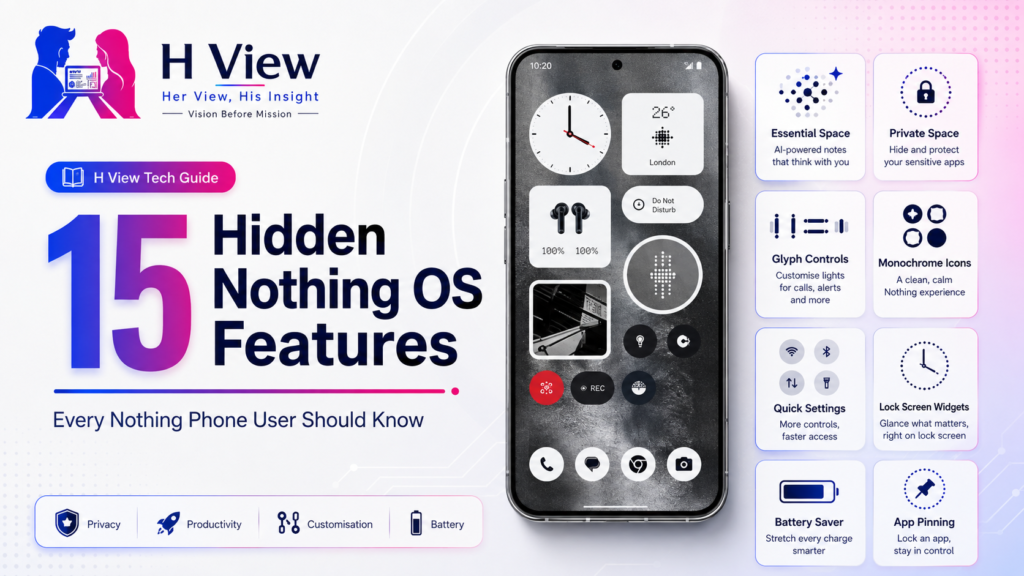
15 Hidden Nothing OS Features Every Nothing Phone User Should Know
Nothing phones attract attention through their transparent-inspired design and Glyph lighting, but the software contains…
 Harika August 2, 2026
  By HarikaUpdated August 3, 202610 min read102 views
Most smartphones today are technically impressive. They have bright displays, powerful processors, capable cameras and batteries that can comfortably last through a working day. Yet when several modern phones are placed side by side, many of them begin to feel surprisingly similar.
The camera modules may move from one corner to another. The frame may become slightly flatter, and the software icons may use different colours. But the overall experience often follows the same familiar formula.
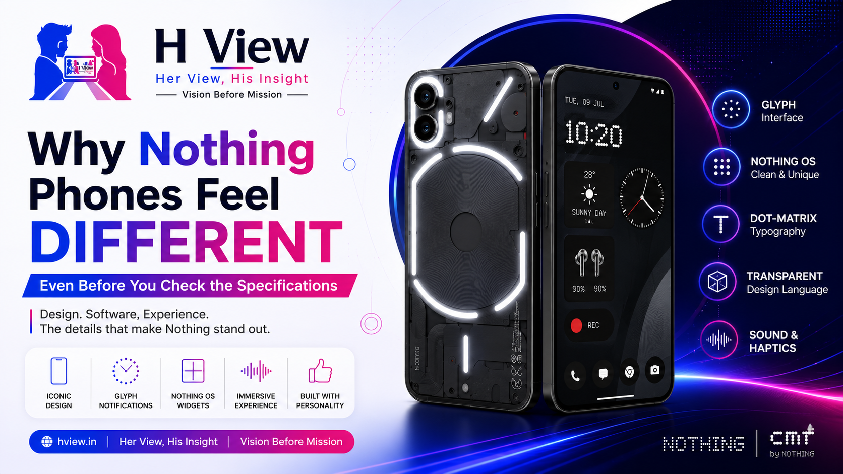
Nothing phones stand out before we even begin comparing processors, camera sensors or charging speeds.
You notice the transparent-inspired construction, unusual rear lighting, dot-matrix typography and carefully coordinated software. Whether someone loves or dislikes the design, it is difficult to mistake a Nothing phone for an ordinary Android device.
That immediate recognition is one of Nothing’s greatest achievements. The company’s official ambition is to make technology feel exciting and enjoyable again, and its phones attempt to deliver that feeling through design, software and interaction—not specifications alone.
This does not automatically make every Nothing phone better than its competitors. However, it gives the products something many smartphones are currently missing: personality.
Specifications remain important. Buyers should consider performance, display quality, battery life, camera reliability, software support and after-sales service before purchasing any smartphone.
However, modern phones have reached a stage where even many mid-range devices provide enough performance for messaging, social media, photography, entertainment, navigation and everyday productivity.
As the basic experience improves across brands, smaller details become more meaningful.
How does the phone feel when you pick it up?
Does the software look like it belongs to the hardware?
Are the animations, sounds and widgets thoughtfully connected?
Does the device have an identity, or does it feel like another rectangular screen built from the same industry template?
Nothing has focused heavily on these emotional and experiential details. That focus is visible before the specification sheet becomes relevant.
Nothing’s transparent-inspired design language is the first reason its phones feel different.
The brand does not simply place a clear plastic panel over random internal components. Its rear designs are carefully arranged to suggest mechanical depth while maintaining a structured, intentional appearance.
Different Nothing generations have interpreted transparency in different ways. Some reveal large circular forms, cable-like lines and symmetrical internal patterns. Newer devices continue to use transparency selectively rather than applying the same rear panel repeatedly.
For example, Nothing describes the Phone (4a) Pro as using its signature transparent treatment around the camera area, where the enclosure exposes hints of the mechanical structures beneath.
That evolution is important. A recognisable design language should remain consistent without becoming repetitive.
Nothing’s phones also make the rear panel feel like an active part of the product. On most smartphones, the back exists primarily to hold the cameras and display the brand logo. On a Nothing phone, the rear is part of the experience.
It contains visual patterns, lighting systems and deliberately exposed design elements. This gives users a reason to notice the device even when the screen is turned off.
The Glyph Interface is probably Nothing’s most recognisable hardware idea.
On compatible models, light strips on the rear can respond to incoming calls, messages, notifications, charging and selected interactions. Nothing also coordinates its preset ringtones and notification sounds with specific lighting patterns and vibration effects.
The practical usefulness of Glyph depends on how someone uses their phone.
A user who keeps the phone face down may appreciate being able to identify certain alerts without turning on the display. Some people may use it for timers, charging indicators or visual notification patterns. Others may enjoy it mainly as a design feature.
Not every Glyph function is essential. In many situations, the lock screen, smartwatch or vibration motor can provide the same information more directly.
However, judging Glyph only by utility misses part of its value.
Glyph gave Nothing a signature interaction. It transformed the rear panel from a passive surface into something that can communicate.
That distinction matters in a market where manufacturers often compete by adjusting the size and arrangement of their camera circles.
Nothing has also shown that it does not want Glyph to remain unchanged forever.
Phone (3) introduced the Glyph Matrix, a circular arrangement containing 489 micro-LEDs. Nothing lists uses including notification displays, camera countdowns, volume visualisation, NFC animations, a rear torch and small interactive experiences.
The company also released a Glyph Developer Kit and a platform where creators can experiment with small tools, games, animations and visual experiences for supported devices.
This makes the concept more interesting because its future is not controlled solely by Nothing’s internal software team. Developers and community members may discover more practical uses.
At the same time, Glyph still faces an important challenge: it must become more useful without becoming distracting.
A phone feature should not require users to remember numerous patterns or constantly turn the device around. The strongest Glyph experiences will likely be the simplest ones—timers, priority alerts, charging progress and information that can be understood instantly.
A distinctive rear design may attract attention, but Nothing OS is what carries the personality into everyday use.
Nothing’s interface uses monochrome icon treatments, large widgets, dot-inspired typography and a visual structure that matches the industrial design of its phones.
This consistency is one of the biggest differences between Nothing and many smaller Android brands.
Some smartphones have visually interesting hardware but use software that feels almost unrelated. Others provide feature-rich software but appear cluttered or inconsistent.
Nothing attempts to make the physical phone, lock screen, home screen, widgets, sounds and animations feel like parts of one product.
Nothing OS 3.0, which was built on Android 15, introduced expanded widgets, shortcuts and interface refinements across several Nothing and CMF devices.
The software does not completely replace the familiar Android experience. Instead, it adds a recognisable layer while retaining access to Android applications and services.
That balance is useful. Nothing can create its own personality without forcing users to learn an entirely unfamiliar operating system.
One of Nothing OS’s most recognisable choices is its use of monochrome styling.
Traditional Android home screens can become visually busy because every application uses its own icon colour, branding and shape. Nothing’s icon treatments attempt to create a calmer and more organised appearance.
For users who enjoy minimalism, the result can feel cleaner and more deliberate.
The widgets continue the same approach. Clocks, weather information, quick controls and system tools use bold shapes and a visual style that looks natural alongside Nothing’s hardware.
However, monochrome icons are not perfect for everyone.
Many people identify applications quickly by colour. Removing those familiar colours can make certain icons harder to distinguish, particularly when several applications have similar shapes.
Nothing’s design approach therefore involves a trade-off. It prioritises visual consistency, but some users may prefer the instant recognition provided by colourful icons.
The benefit is that users are not forced to follow one style permanently. Android’s flexibility still allows personalisation.
Nothing’s identity is not limited to what users can see.
Its ringtones, notification sounds and Glyph patterns are designed to work together. When the lighting, sound and vibration respond as one coordinated sequence, the phone can feel more intentional than a device where each element appears to have been designed separately.
These details rarely appear at the top of a specification comparison, yet they influence how a phone feels throughout the day.
The click of a button, the strength of a vibration, the timing of an animation and the sound of an alert can make a device feel polished—or unfinished.
Nothing understands that product experience is often created through dozens of small decisions rather than one headline feature.
A Nothing phone is more likely than many conventional smartphones to attract questions.
People may ask about the lights, transparent design or unusual software. This gives the device a social quality that specification-focused phones may not have.
For some buyers, this is part of the appeal. They want a device that feels individual and does not resemble every other phone in the room.
For others, the attention may be unnecessary. Some users want their smartphone to remain discreet, familiar and completely practical.
Nothing’s design is therefore not meant for everyone.
That is not necessarily a weakness. A brand with a strong identity should be willing to create products that inspire clear reactions.
The alternative is a design that offends nobody but excites very few people.
Samsung often focuses on a broad ecosystem, extensive features and displays refined across many generations.
Google Pixel phones emphasise Google’s software, camera processing and AI-led services.
OnePlus traditionally built its identity around speed and performance, while Motorola often prioritises clean Android experiences and practical features across different price categories.
Nothing approaches Android from a design-first perspective.
It asks how hardware, typography, lighting, sounds and software can form one recognisable experience.
That does not mean Nothing beats these companies in every area. Samsung offers a more mature ecosystem. Google has deeper control over Android and its AI services. Established manufacturers often have larger service networks, more accessories and longer histories of camera development.
Nothing’s advantage is not that it dominates every comparison. Its advantage is that it feels unlike most of them.
A distinctive identity cannot replace strong fundamentals.
A phone may look creative but still needs dependable performance, good cameras, battery efficiency, stable software and accessible customer support.
Nothing’s products should therefore be evaluated individually.
Some buyers may discover that the Glyph Interface becomes part of their routine. Others may turn it off after the first few days.
Some may love the monochrome home screen, while others may immediately restore colourful icons.
The transparent rear may feel futuristic to one person and overly mechanical to another.
These reactions are personal. H View should not present a design preference as an objective measure of product quality.
The correct question is not simply, “Does this phone look different?”
It is, “Does the complete experience justify its price for this particular buyer?”
A Nothing phone may be a strong choice for someone who:
A Nothing phone may be less suitable for someone who:
The decision should depend on the specific model, price and alternatives available at the time of purchase.
Nothing phones use transparent-inspired rear designs, exposed mechanical-style details, Glyph lighting and a visual identity that continues into Nothing OS.
Glyph can be useful for priority notifications, calls, charging information, timers and selected visual alerts. Its value depends heavily on how the owner uses the phone.
Nothing OS is based on Android. It adds Nothing’s own widgets, icon treatments, typography, animations and features while retaining access to Android applications and Google services.
Yes. Nothing allows users to enable or disable Glyph lighting through the phone’s Glyph Interface settings.
No. They offer the normal performance, camera, display and software features expected from Android smartphones. However, individual models must still be evaluated because design alone does not guarantee better overall value.
Nothing phones are best suited to buyers who want distinctive hardware, clean software and a device that feels less conventional than many mainstream Android alternatives.
Harika is the co-founder of H View and covers AI, technology, gadgets, digital tools, online platforms, and modern internet trends. Her articles focus on simplifying complex topics with practical explanations, balanced opinions, and reader-first insights.
Share your real experience and help other readers decide better.
No community views yet. Be the first to share yours.
Nothing phones attract attention through their transparent-inspired design and Glyph lighting, but the software contains…
Harika August 2, 2026 
Nothing is disrupting the tech world with its unique design-led approach, offering transparent and expressive…
Harika July 16, 2026