

Best Digital Marketing Tools in 2026: What Marketers Actually Need and What They Can Skip
Open LinkedIn for a few minutes and you will probably come across a colourful graphic…
 Harika October 6, 2026
  By HarikaUpdated July 16, 202610 min read61 views
Online shopping feels simple from the outside.
Open the app, search for what you need, compare a few options, apply a coupon, pay through UPI or card, and wait for delivery. It looks like the user is fully in control.
But many shopping apps are not designed only to help you buy. They are also designed to make you stay longer, add more items, feel urgency, accept extra charges, and complete the purchase before you think too much.
That is where dark patterns come in.
A dark pattern is a design trick that quietly pushes users toward a decision they may not have taken clearly or freely. It may not look like a scam. In fact, it may look like a normal button, offer, timer, checkbox, pop-up, or checkout screen.
At H View, our practical view is simple:
Good design helps users decide better. Dark design pushes users to decide faster.
In this article, let’s understand how dark patterns in online shopping work, why they make people spend more, and how smart buyers can protect themselves.
Dark patterns are design choices that influence users in a misleading or unfair way.
They are not always obvious. Sometimes they look harmless. But their purpose is to make the user do something that benefits the platform more than the customer.
For example, an app may make it easy to subscribe but difficult to cancel. A website may add an item to your cart without clearly asking. A shopping app may show a timer that makes you feel the offer will disappear quickly. A checkout page may show charges only at the end.
These small design choices can affect how we spend.
Most people do not overspend because they are careless. They overspend because apps are very good at reducing hesitation.
Dark patterns work because they target normal human behavior.
We do not always make shopping decisions calmly. We are often tired, busy, distracted, emotional, or in a hurry. Apps understand this very well.
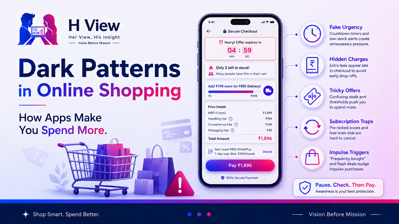
When we see “Only 2 left,” we fear missing out.
When we see “Add ₹49 more for free delivery,” we feel we are saving money.
When a coupon is already applied, we feel lucky.
When a timer is running, we stop comparing.
When payment is one tap away, we stop calculating.
This is not just a technology problem. It is a behavior problem.
The more frictionless shopping becomes, the more discipline the user needs.
Urgency is one of the most common tricks.
You may see messages like:
“Only 1 left.”
“Deal ends in 04:59.”
“15 people are viewing this now.”
“Price may increase soon.”
“Limited stock available.”
Sometimes urgency is genuine. During real sales, stock and prices can change. But when every product always looks urgent, users should be careful.
The goal is to make you buy before you compare.
A smart buyer should pause and ask: “Would I still buy this if there was no timer?”
Basket sneaking happens when an extra product, service, donation, protection plan, warranty, subscription, or add-on is quietly added to your cart.
Sometimes it is pre-selected. Sometimes it appears as a small checkbox. Sometimes the app makes it look like part of the normal order.
This is especially common in travel bookings, food delivery, shopping carts, event tickets, and software purchases.
Before paying, always check the final cart carefully. The amount at checkout should match what you actually wanted to buy.
Many users start with one price and end with another.
A product may look affordable at first, but at checkout you may see:
The problem is not always that fees exist. Businesses do have costs. The problem is when fees are shown too late or not explained clearly.
A smart buyer should not judge the product by the listing price alone. The final payable amount is the real price.
This is one of the most common spending triggers.
You open an app to buy one item for ₹150. The app says:
“Add ₹49 more for free delivery.”
So you add something for ₹69. Now the app shows another offer:
“Buy 2, get 1 free.”
Suddenly, your ₹150 order becomes ₹350.
It feels like saving, but often it is just extra spending.
Free delivery is useful only if you were already planning to buy those extra items. If you are adding things just to cross a threshold, the app has successfully increased your order value.
Coupons look exciting, but they can also confuse users.
Sometimes the discount applies only above a certain amount. Sometimes it excludes popular products. Sometimes it works only with a specific payment method. Sometimes it gives cashback instead of instant savings. Sometimes the maximum discount is much lower than the headline suggests.
For example, “50% off” may look huge, but the actual discount may be capped at ₹100.
The right question is not “How big is the offer?”
The right question is “How much am I actually saving?”
Subscription traps are very common in apps, OTT platforms, learning tools, software, fitness apps, design tools, and premium shopping services.
The signup may be easy. The cancellation may be hidden behind multiple steps.
You may see:
A genuine subscription should be easy to understand and easy to cancel.
If cancellation feels like a maze, that is a warning sign.
Confirm shaming is when the app makes you feel guilty for saying no.
For example:
“No thanks, I don’t want to save money.”
“I prefer paying full price.”
“I don’t care about protection.”
“No, I want to miss this deal.”
This type of wording is not helpful. It is emotional pressure.
A simple “No thanks” should be enough. Users should not be made to feel foolish for refusing an offer.
Forced action happens when a platform makes you do something unnecessary before completing your actual task.
Examples include:
Some actions may be required for genuine reasons. But when the requirement feels unrelated to your purchase, it is worth questioning.
This happens when design makes one choice more visible and another choice harder to find.
For example:
The “Buy Now” button may be bright and large, while the “Skip” option is tiny and grey.
The paid plan may look recommended, while the free plan is hidden.
The add-on may be highlighted, while the remove option is difficult to notice.
Design affects decisions. Apps know this.
Before clicking the biggest button, check whether there is another option.
Quick commerce has made shopping extremely fast.
This is helpful when you need milk, medicine-related essentials, groceries, baby products, or something urgent. But it can also turn small cravings into repeated spending.
You may open the app for bread and end up adding chips, cold drinks, chocolate, ice cream, biscuits, and one random item from the offer section.
Because delivery is fast, the emotional gap between craving and purchase becomes very small.
That is why quick commerce needs self-control. It is useful for genuine needs, but risky when it becomes a boredom habit.
UPI and digital payments are one of India’s biggest conveniences. They save time and make transactions simple.
But digital payments also reduce the feeling of physically spending money.
When you pay cash, you see money leaving your hand. When you scan and pay, the transaction is quick and almost invisible. That can make small purchases feel less serious.
This matters because online shopping and UPI together make spending very smooth.
Smooth payment is good for convenience. But if users do not track expenses, it can quietly increase monthly spending.
No.
Not every offer is a dark pattern. Not every timer is fake. Not every recommendation is manipulative. Not every delivery fee is unfair.
Offers can genuinely help users save money. Recommendations can help users discover useful products. Subscriptions can provide real value. Fast checkout can save time.
The issue is not the existence of offers.
The issue is whether the user is getting clear, honest, and complete information before making a decision.
A good shopping experience gives choice. A dark pattern pushes behavior.
You do not need to stop shopping online. You only need to become more aware.
Before placing an order, take a short pause and check:
A 30-second pause can save a lot of unnecessary spending.
Use this simple rule:
Need first. Offer second. Payment last.
First check whether you need the product.
Then check whether the offer actually helps.
Only after that, pay.
Most overspending happens when this order is reversed. We see the offer first, feel tempted, and then create a reason to buy.
From the user experience side, online shopping is genuinely convenient. It saves time, gives more options, and helps people buy from home.
But the experience can become overwhelming when every screen shows a new offer, timer, add-on, coupon, or urgency message.
A good app should make shopping easier. It should not make users feel rushed or confused.
For daily users, especially students, families, and working professionals, awareness is important. The goal is not to avoid online shopping. The goal is to stay in control while shopping.
From the practical side, dark patterns exist because they work.
Every extra item added to the cart, every subscription accepted, every free-delivery threshold crossed, and every last-minute checkout decision increases revenue for the platform.
This is why users should understand the business logic behind app design.
Shopping apps are not only showing products. They are guiding behavior.
Once users understand that, they can shop with more control.
Dark patterns are not always easy to spot, but users can protect themselves with simple habits.
Do not rush checkout.
Do not believe every urgency message.
Do not add items only for free delivery.
Do not ignore final charges.
Do not accept subscriptions without checking cancellation.
Do not treat UPI payments as invisible money.
At H View, our recommendation is simple:
Shop online for your needs, not for the app’s targets.
Dark patterns are design tricks used by websites or apps to push users into actions like buying more, subscribing, sharing data, accepting add-ons, or paying charges without fully noticing.
India has issued guidelines to prevent and regulate dark patterns on digital platforms. These guidelines identify several deceptive design practices as unfair trade practices.
Basket sneaking happens when an extra product, service, fee, donation, subscription, warranty, or add-on is added to your cart without clear and active consent.
Apps may use urgency timers, free-delivery thresholds, recommended add-ons, confusing coupons, hidden fees, auto-selected options, and one-click payments to increase spending.
Check the final cart, read charges carefully, avoid impulse purchases, question urgency messages, review subscriptions, compare prices, and pause before payment.
Online shopping is useful. Quick delivery is useful. Digital payments are useful.
But convenience should not quietly take control of your spending.
Dark patterns work because they make small decisions feel automatic. The more aware you are, the less power these tricks have.
At H View, our final view is simple:
A smart shopper does not only compare prices. A smart shopper also understands how apps try to influence decisions.
Harika is the co-founder of H View and covers AI, technology, gadgets, digital tools, online platforms, and modern internet trends. Her articles focus on simplifying complex topics with practical explanations, balanced opinions, and reader-first insights.
Share your real experience and help other readers decide better.
No community views yet. Be the first to share yours.
Open LinkedIn for a few minutes and you will probably come across a colourful graphic…
Harika October 6, 2026 
When an employee resigns, many organisations move quickly into replacement mode. The manager informs HR,…
Harika October 6, 2026 
For many corporate employees, the workday begins long before they actually start working. They wake…
Harika October 5, 2026 
Many projects begin with an assumption that sounds reasonable on paper: the client will explain…
Harika October 1, 2026